Showing posts with label Evaluative Comments. Show all posts
Showing posts with label Evaluative Comments. Show all posts
Ancillary Task Edit Decisions
Much like with my Music Video, I decided it was necessary to produce an edit decisions document for my ancillary tasks. The following document shows these decisions:

Edit Decisions
Instead of an edit decisions list as I made the Music Video, I decided it would be much more useful to wait until I had finished the video to detail every single editing technique and complex shot choice in the following document. I believe it sufficiently details the effort I put into my work:
Artist Logo
An important element of my ancillary tasks - and my main task should I choose to include it - is the artist logo. This reveals the identity of the artist and, in most cases, becomes the one image a fan or even anyone can look at and immediately know the artist.
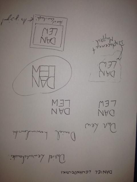
Logos vary immensely; I carried out a small amount of research before beginning the task, but only to grasp an idea of what has been done as it is important that they remain original. I then began mocking designs, playing with the artists name, Daniel Lewandowski, to find a structure for his name:


 After this, I worked on my first draft. This design involved a crumpled piece of paper - in-keeping with my website - that the text was formed to. To achieve this result, I used a displacement map in photoshop. This involved altering the contrast and brightness of the background image to make the contours much more obvious. The map is then applied to the text which then forms itself to the paper and appears to be written on it. This process created:

 The second design involved the inclusion of a Polaroid picture background with a signature caption for a bit more personality as the first design wasn't overly complex or revealing of the artist/brand. The font I used was Jellyka Saint Andrews Queen as it caught my eye as a very detailed, personal font that could be mistaken as true handwriting, which is rare. Utilising the way the font alters characters to drawn images, I added some extra characters for decoration:


 I really like this logo as it feels like it contains all of the elements I wanted and serves as a memorable brand identity. Finally, I put the logos up for a vote amongst my peers to ascertain which was the best when my audience was concerned. Luckily, the final logo reined as champion and I agreed with my demographic. This design, therefore, will be the logo I will use in my tasks.
Logos vary immensely; I carried out a small amount of research before beginning the task, but only to grasp an idea of what has been done as it is important that they remain original. I then began mocking designs, playing with the artists name, Daniel Lewandowski, to find a structure for his name:
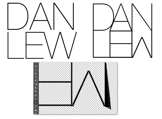
Once I had done this initial planning, I moved on to experimenting in Photoshop. I had already formed the idea of what I wanted to create so it was up to following my plans from here. The most important element of all of my designs was the specific way in which I designed the lettering so the first port of call was to create that. My favourite, san-serif font is Helvetica and the slightest version of this is Helvetica Neue Ultralight so that was the end choice. The font needed a fair bit of editing, however, so I converted the letters to paths in photoshop and reshaped them until they resembled what I wanted. The image to the left is the original font where the right image is the final result:
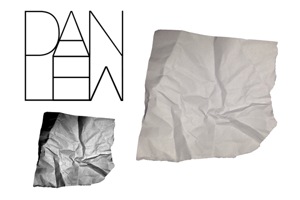 After this, I worked on my first draft. This design involved a crumpled piece of paper - in-keeping with my website - that the text was formed to. To achieve this result, I used a displacement map in photoshop. This involved altering the contrast and brightness of the background image to make the contours much more obvious. The map is then applied to the text which then forms itself to the paper and appears to be written on it. This process created: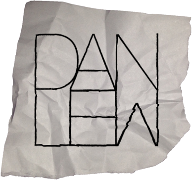
Logo 1
 The second design involved the inclusion of a Polaroid picture background with a signature caption for a bit more personality as the first design wasn't overly complex or revealing of the artist/brand. The font I used was Jellyka Saint Andrews Queen as it caught my eye as a very detailed, personal font that could be mistaken as true handwriting, which is rare. Utilising the way the font alters characters to drawn images, I added some extra characters for decoration: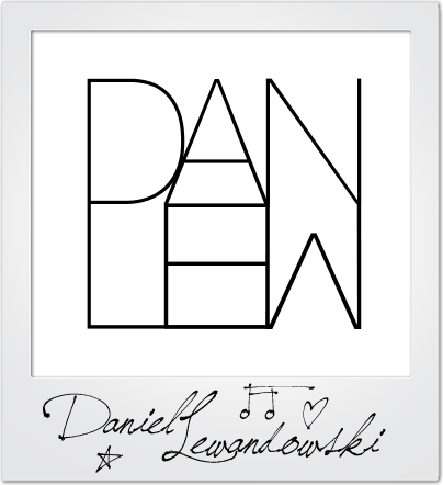
Logo 2
The design didn't look quite right to me and I even asked for feedback too, which a final idea flourished. I offered up the idea of a background image that was slightly blurred so as not to take away from the logo, but add colour and more of a persona. The logo then became:
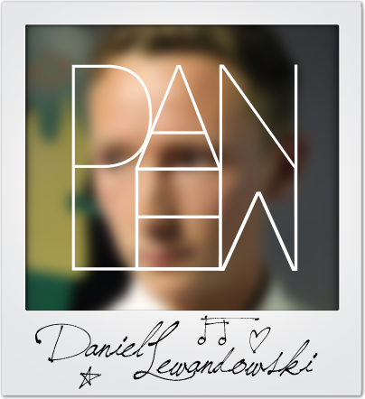
Logo 3
 I really like this logo as it feels like it contains all of the elements I wanted and serves as a memorable brand identity. Finally, I put the logos up for a vote amongst my peers to ascertain which was the best when my audience was concerned. Luckily, the final logo reined as champion and I agreed with my demographic. This design, therefore, will be the logo I will use in my tasks.
Ancillary Task Research - Website Home Page
Concurrent with my Digipak research, I am carrying out research into Artist websites so that I can create a website conventional to these. After a little research, however, I wasn't incredibly impressed with a great number of the designs so I am also carrying out research into other websites to take inspiration from and form ideas to merge with the band's website. A feature I really liked, however, from Jake Bugg's website is the rolling video background which includes all of his music videos and some promotional films. This means the user can navigate his site while experiencing his content, creating an incredibly effective promotional site. I will most probably be using the HTML5 code here for this feature:
As there isn't much content on the first page, though, I plan to merge this idea with the current structure of the Spotify website where images and backgrounds scroll and differing speeds which heightens interactivity and makes information transfer more efficient:
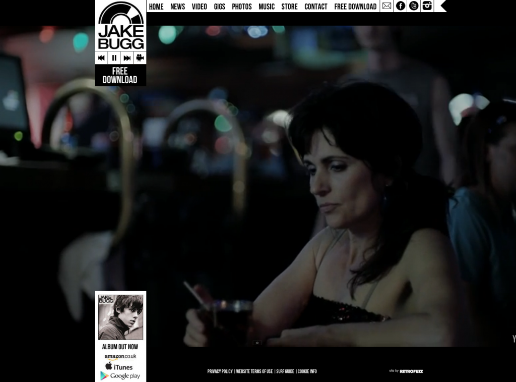 |
| www.JakeBugg.com |
After some further research, I found that the effect seen above is known as the Parallax Scrolling effect and can be achieved a number of different ways. As this is definitely my favoured idea, I have looked into certain source code and tutorials for creation; one of which, I found at www.GitHub.com and offers all of the code needed for including videos, backgrounds, sprites and text which covers everything I would need. This idea allows for a great deal of band promotion as images feature very heavily. I can take a number of photographs on our shoots to satisfy this.
Another artist site that I think looks appealing is Tom Milsom's. The main feature that makes similar web pages lose appeal seems to be the over saturation of tour dates and the lack of organisation with these. Milsom's page isn't like this, but Like Bugg's has little content so any inspiration taken would have to be combined with others. The photography is very nice, however, so I can draw from this:
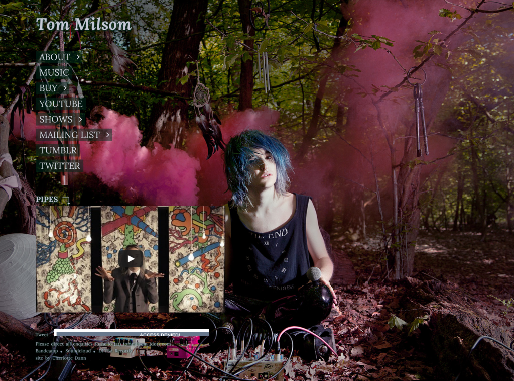 |
www.TomMilsom.com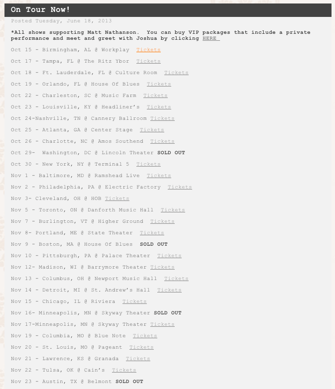 In addition, I want to create a raw theme by including elements such as ripped paper backgrounds to lay titles over which I would create myself as quality stock photos of this are rare:  |
Ancillary Task Research - Digipak
As part of my end project, I am to create an accompanying Digipak and Webpage as ancillary tasks. The first I shall be working on is the Digipak, though before designing a concept for my own, I would like to look into preexisting Digipaks to replicate the conventions and to create a successful design that looks professional and legitimate. Below, therefore, I will be including a number of album artworks and Digipaks with analysis:

 I really like the Tom Odell - Long Way Down album as it's simple and incorporates the widely used, but little perfected white on a light photograph, while still visible. The image is the entire album cover, however, which would be illfitted for the project due to the lack of skill showcasing. The depth of field is particularly effective with the focus purely on the model which looks very nice. This, I could incorporate in my final product as it's very minimalist, but technical.

The back cover is quite contrapuntal to the front; where the front has a soft focus depth of field, the back is more gritty though I like this. There is a synergy between the two covers with the second use of the model. Though his features aren't visible, his clothing is recognisable and forms a link between the two. The track list uses the same bold font, which is quite effective.
 This is an alternative Tom Odell cover for an EP, but I feel it's very effective and shows a great deal of photographic skill and editing. The san serif, blocky typography seems quite conventional of this style of music so that could be something to think about. I like the fish eye lens use, but it would be very iconic of this album cover if I were to do the same.


 The self-titled, Jake Bugg album is again very simple, but in my opinion it looks very nice. The raised contrast and desaturation shows a competence with graphic manipulation, but photography clearly shows the decision making process undergone. The model is arched forward, which leaves sufficient space for the title behind his head. The cropping also slightly takes the edge off of his hair line which is obviously intentional, it shows how the record challenges uniformity and polish.
Very much like the Tom Odell artwork, this cover reuses the model in the same clothing to create synergy. The perspective created by the street is very nice and connotes such things as journeying and moving on which seems to be the mantra of the album.

Edd Plant's Confidence Tricks skillfully shows how an image can be removed from the background and the backdrop can be manipulated. Having rendered clouds, the producer has introduced some interesting flourishes in red and black which connote playing cards and therefore back up the album's title. Card names such as the Ace of Hearts also feature which furthers this. The choice of props and clothing is also in keeping. The font, however, is quite common and therefore doesn't look as great as it could. I may take inspiration from this cover, but the font will be considered deeply and I will ensure to not use a famous, common one.


 This album is particularly good because it showcases an extremely good set of editing skills. The photograph has been manipulated such that it now resembles a cartoon wth only two tones (for half of he image). The, then, introduction of a red pop art style gradient, really makes the art work pop out which would be the producer's intention. Logo wise, the incorporation of both names as one looks very nice and will clearly be memorable. The back cover continues the pop art style which I think looks really nice and achieves a great look while not overly difficult to reproduce. Again, the font is san serif and, in this case, entirely capitalised which is bold and iconic of the punky genre. The convention holds for more than punk, however, evidenced by the previous two album arts. The disc, which seems to be the same for most, merely continues the theme in terms of colour and logos or is fairly bare and quite minimalistic, such as the Jake Bugg disc.
 Erase This by Alan Lastufka and Luke Conard is one of my favourite album covers. The abstract nature of the record really shines through with the paper design and title orientation. I am a real fan of the model being removed from their original background such as this and Confidence Tricks; I just need to be aware that making the image then look really nice will need some working. I also like the raw style overlay that has been used to merge the model with her background which is something I may attempt to use.

- The thematic design shows that digipaks must be a cohesive product where the designs of each face follow through the end result.
- The printing on the disk is similar to an image on another face which increases the cohesion.
- Minimalist design with a nicely framed, simple image of the artist, accompanied by typography.
- Information on the inside cover
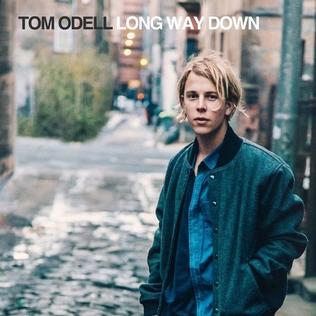 I really like the Tom Odell - Long Way Down album as it's simple and incorporates the widely used, but little perfected white on a light photograph, while still visible. The image is the entire album cover, however, which would be illfitted for the project due to the lack of skill showcasing. The depth of field is particularly effective with the focus purely on the model which looks very nice. This, I could incorporate in my final product as it's very minimalist, but technical.
The back cover is quite contrapuntal to the front; where the front has a soft focus depth of field, the back is more gritty though I like this. There is a synergy between the two covers with the second use of the model. Though his features aren't visible, his clothing is recognisable and forms a link between the two. The track list uses the same bold font, which is quite effective.


Very much like the Tom Odell artwork, this cover reuses the model in the same clothing to create synergy. The perspective created by the street is very nice and connotes such things as journeying and moving on which seems to be the mantra of the album.
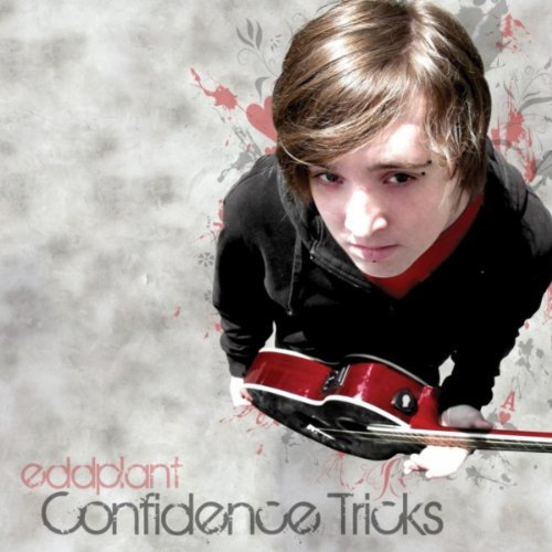
Edd Plant's Confidence Tricks skillfully shows how an image can be removed from the background and the backdrop can be manipulated. Having rendered clouds, the producer has introduced some interesting flourishes in red and black which connote playing cards and therefore back up the album's title. Card names such as the Ace of Hearts also feature which furthers this. The choice of props and clothing is also in keeping. The font, however, is quite common and therefore doesn't look as great as it could. I may take inspiration from this cover, but the font will be considered deeply and I will ensure to not use a famous, common one.


 This album is particularly good because it showcases an extremely good set of editing skills. The photograph has been manipulated such that it now resembles a cartoon wth only two tones (for half of he image). The, then, introduction of a red pop art style gradient, really makes the art work pop out which would be the producer's intention. Logo wise, the incorporation of both names as one looks very nice and will clearly be memorable. The back cover continues the pop art style which I think looks really nice and achieves a great look while not overly difficult to reproduce. Again, the font is san serif and, in this case, entirely capitalised which is bold and iconic of the punky genre. The convention holds for more than punk, however, evidenced by the previous two album arts. The disc, which seems to be the same for most, merely continues the theme in terms of colour and logos or is fairly bare and quite minimalistic, such as the Jake Bugg disc.
Actor Change
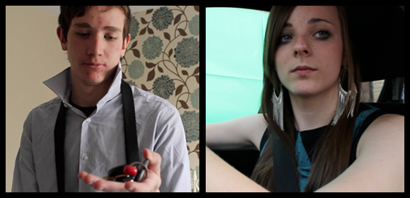
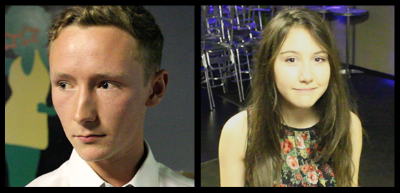
I have lost a small amount of footage due to this change, but my time has been saved in the long term and I don't begrudge having changed.
Scheduling Difficulty
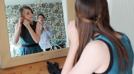 As I am working with a venue which can only offer me restricted times to film and actors, some with full time work commitments, it has been incredibly difficult to organise when I can film scenes. The first film shoot was only possible when it was completed due to surplus time during pre-booked holidays which were not especially for production. I have now secured an appointment to discuss suitable days to film, though I have been informed that the least busy periods are Mondays and Wednesdays in the day. This could be a potential problem as my female actor works 9 till 5 every day where my male actor begins work at 5 o'clock, which leaves no time for filming their joint scenes. I will have to enquire about other times where the room may be available for a short amount of time where I can film the shots that involve both actors. Luckily, the actor I need for most of the production, is available most of the day.
 Audience Feedback on Initial Footage
After filming, I decided to ask some of my colleagues what they thought of the footage to receive some feedback on what I had done and what they felt I should do for future shots. Asking three colleagues and one of my teachers, I received a varied range of comments on my shots. Below are some of the screenshots I used in the initial footage recount with comments from them:

Shot 34

Colleague 3: "This shot works well and, having seen the edited footage already, it works really well, but I would advise you use green screen as little as possible from here on out because removing the undesired elements is a lot of work."
Teacher: "The movement is nice and smooth which utilises your dolly well."
Shot 34.5

Colleague 2: "Like Colleague 3 said, the green screen does still look good, but it is obviously a lot of work which could be avoided. If you were planning again, it may have been better to film with an actual background though steadiness is compromised."
Shot 37

Colleague 1: "I really like this shot, though the focus could be slightly sharper; the emotion really shines through."
Teacher: "The closeness to the character and his sheer emotion is almost eery - I feel your choice of actor was well done as they have really committed themselves to the performance."
Shot 49

Teacher: "Using steadicam, you have followed the character well which was your intention - the turn could be longer though due to that the shot doesn't last too long."
Shot 25

Colleague 1: "I think you did the right thing, by swapping characters; the driver storming off and throwing the keys to indicate she wants to leave seems more believable than the one who is not driving leaving and having to wait for the driver anyway."
Colleague 2: "The framing works well, and you did well to re-imagine it after the initial frame didn't work.
Shot 26
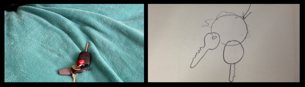
Teacher: "The focus on the keys is very nice and it is clear you did this before starting the scene."
Shot 34
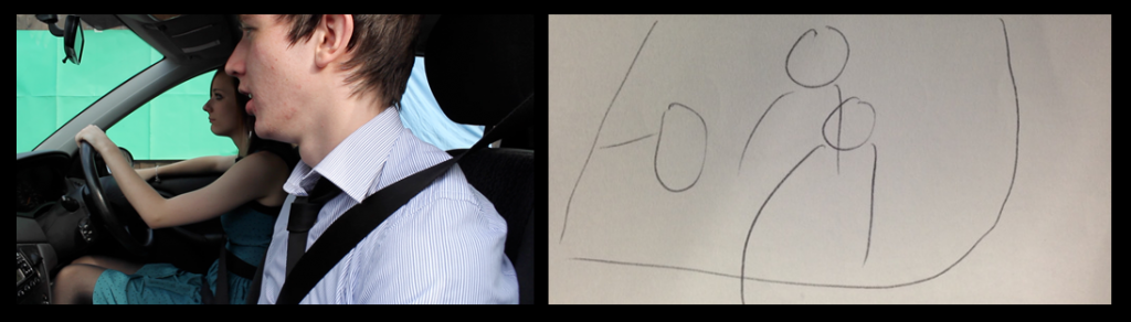
Colleague 3: "This shot works well and, having seen the edited footage already, it works really well, but I would advise you use green screen as little as possible from here on out because removing the undesired elements is a lot of work."
Teacher: "The movement is nice and smooth which utilises your dolly well."
Shot 34.5
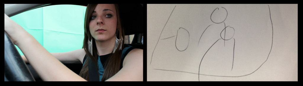
Colleague 2: "Like Colleague 3 said, the green screen does still look good, but it is obviously a lot of work which could be avoided. If you were planning again, it may have been better to film with an actual background though steadiness is compromised."
Shot 37
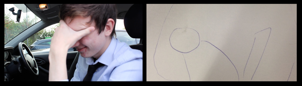
Colleague 1: "I really like this shot, though the focus could be slightly sharper; the emotion really shines through."
Teacher: "The closeness to the character and his sheer emotion is almost eery - I feel your choice of actor was well done as they have really committed themselves to the performance."
Shot 49
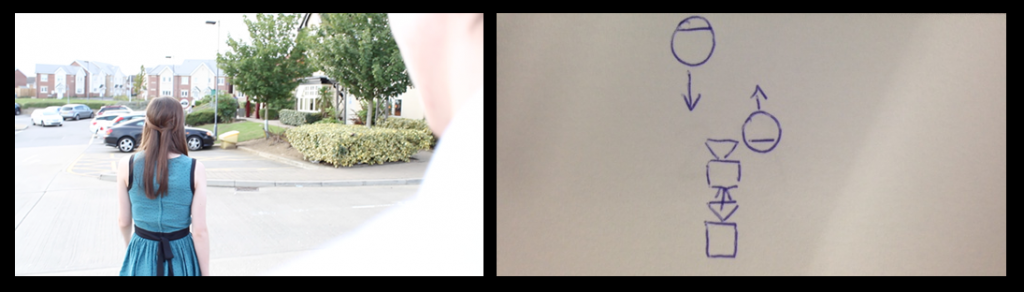
Teacher: "Using steadicam, you have followed the character well which was your intention - the turn could be longer though due to that the shot doesn't last too long."
Recount of First Video Shoot
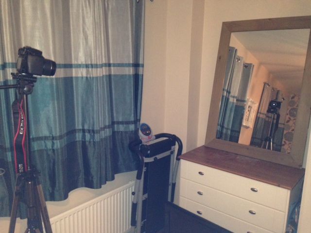 The first video shoot was to complete all of the external and non-venue location scenes so that the main focus is to secure the venue shots when I have received confirmation of a location. As the filming involved only a few scenes and was my first shoot, I want to evaluate the work shot by shot below, detailing changes I made in production and how they will benefit me in the long run. Unfortunately, due to the sheer mass of shots that will be filmed on location, I won't be able to be as detailed with every shot, but will ensure all changes are noted for exposition on either my blog or overall evaluation. Shot 35 and 39 were omitted in filming as I decided they were unneeded.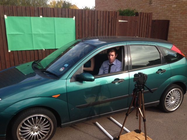
The above is evidence of the most adventurous shot of the day; I will delve further in evaluating it when I reach it below, but it required the use of a green screen, two actors and a camera dolly. This will then be post-produced to give the effect that the car is moving.
Shot 25
This shot needed to be precisely framed, though once it was it looked very nice. When I conceptualised the shot, I did not anticipate how the reflections would work, but the overall idea was clear. I also decided that the scene would flow easier if I swapped the two characters around which was decided on the shoot.
Shot 26
This shot worked as expected, I focused the lens with the keys in shot to begin with to perfect it, before removing them to begin filming. I am glad the keys weren't entirely central as the shot then looks less set up.
Shot 27
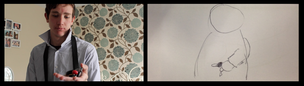
As it was a tracking shot, this took a few takes, but worked as expected so didn't take any longer than needed. I like the framing and focus of the shot - offering a close mid shot which reveals the emotion of the actor.
Shot 34
Having begun the chroma key aspect of this shot, editing out the green and background of the car, the shot is proving very effective. The process does, however take a very long time requiring rotoscoping and keying. Any remaining green edges are also removed when I desaturate the video in post production.
Shot 34.5
This shot also was difficult to rotoscope as there are green reflections on the actors hair, though after rotoscoping and post production it looks realistic and serves it's purpose.
Shot 36
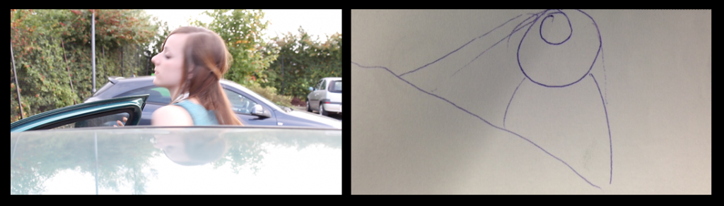 Again, taking a couple takes to ensure the shot was correct, I like the final shot and an unplanned element which is the shake of the camera as the door slams is really effective, i feel.
Shot 37 & 38
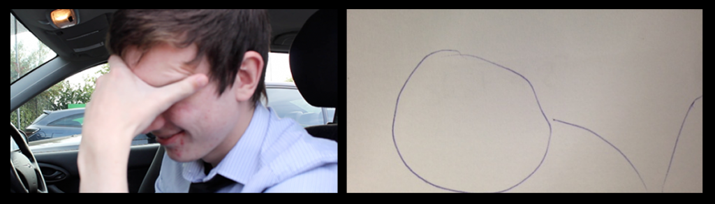
Directing the actor slightly differently from the storyboard, I chose not to have the actor leaning forward which effects the timing of the following shot which will now be a slightly zoomed version of the same footage.
Shot 49 & 50
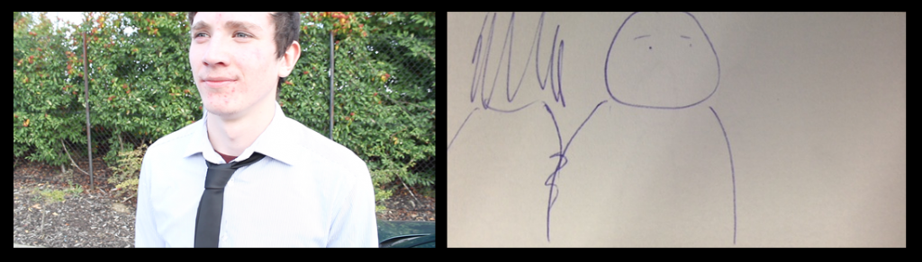
The content of this shot is slightly different though the effect is the same; rather than a barge of the shoulder I have the male character calling after the female who turns and then walks on as if to 'snub' him. The next shot is a reverse shot to show the male characters reaction and I feel this shows well. I would, however, like to lower the lighting in post production so it is not so glaring.
Theory Application: Andrew Goodwin
Andrew Goodwin
Andrew Goodwin is a theorist that focuses on Music Videos, so it is very applicable to this project. He states that there are five key aspects to a successful music Video that an audience member looks out for and is ultimately satisfied by. These are as follows:
- Thought Beats
- Narrative & Performance
- Star Image
- Relation of Visuals to the Song
- Technical Aspects of the Music Video
The least obvious of these five is the Thought Beats - it relates to seeing the sound in your head and, ultimately, creating links between the style and sound of a song with the artist who it is created for. Music Videos must therefore use appropriate imagery to relate with the audience and enforce memorability.
The narrative and performance is important as an audience member does not immediately understand an entire narrative from just the song involved. With the addition of the Music Video's narrative, the whole story is conveyed and the audience no longer need to imagine the story. In this aspect, Goodwin states how important the lip sync is to a Music Video and how it ties up the authenticity of a story's relation to the singer/actor.
 The star image relates to the individual (often the singer) that the audience is persuaded to support and connect to. This not only applies to Music Videos, but Band management where even in a larger band, a star is formed that the audience eventually likes more than any other, such as Take That with Robbie Williams and after his leave, Gary Barlow or The Jacksons with Michael.
I believe, most importantly, are the visuals being parallel to the audio - unless the intent is to be purposefully contrapuntal - and that is one of the aspects detailed by Goodwin. There are three forms of this:
- Illustration: Visuals that are entirely parallel, sometimes fully representing the lyrics exactly with very little difference in story.
- Amplification: Desired meanings are conveyed, used more to represent morals.
- Disjuncture: As aforementioned, visuals that are completely contrapuntal to the audio and often abstract.
 The technical aspects are very important; they involve the skills required and knowledge needed for a successful text. The four main areas are Camera Work, Editing, Mise-En-Scene and Sound. In terms of camera work, a successful piece must portray an array of shot speed, movement and design to interest the audience. Editing in Music Videos refers mostly to cutting to the beat of a song and creating parallel pace. Mise-en-scene is important as it refers to everything in the scene and manipulating this can produce a range of desired effects, enabling messages to be conveyed well. Sound is, oddly, not as relevant as the others other than a relation between the visuals and song. It sometimes applies with foley which should be of a high enough quality to fit with the rest of the project.
Theory Application: Uses and Gratifications
Uses and Gratification Theory
The Uses and Gratifications theory (U&G) is widely renowned as the turnaround theory; it doesn't challenge the claims of other theories, it focuses on an area of the media that no other had done before. Where most media theories focus on 'media effects' or what media does to people, the U&G theory outlines what people do with media. The gratifications side of the theory also covers the older side of theories as gratification involves the positive effects of media on people and therefore covers earlier areas.

Originally conceptualised in 1940, the U&G theory was not popularised until 1974 when Blumler and Katz wrote about the individual needs of audience socially and psychologically. Despite this, however, the lesser known theorist, Denis McQuail detailed the four categories all audiences fall within when they consume media and what they, therefore, do with this media, which is the most famous form of the U&G theory. Below are the four categories and their criteria:
Information
The Uses and Gratifications theory (U&G) is widely renowned as the turnaround theory; it doesn't challenge the claims of other theories, it focuses on an area of the media that no other had done before. Where most media theories focus on 'media effects' or what media does to people, the U&G theory outlines what people do with media. The gratifications side of the theory also covers the older side of theories as gratification involves the positive effects of media on people and therefore covers earlier areas.

Originally conceptualised in 1940, the U&G theory was not popularised until 1974 when Blumler and Katz wrote about the individual needs of audience socially and psychologically. Despite this, however, the lesser known theorist, Denis McQuail detailed the four categories all audiences fall within when they consume media and what they, therefore, do with this media, which is the most famous form of the U&G theory. Below are the four categories and their criteria:
Information
- News on events globally and locally
- Opinions or popular advice
- Teaching skills or knowledge
- Finding similar views to their own
- Evaluating own views
- Identifying whether another's views are like their own
- Social news for empathy
- Identifying with others (extension of identifying one's self)
- Finding conversation subjects
- Substitute for real-life similar views
- Allows for relating with family and friends.
- Escapism and immersing one's self
- Relaxation
- Confirmation of cultural views (similar to identity, but giving enjoyment due to this)
- Time wasting
- Evoke sexual arousal or emotion
The Uses and Gratifications must be taken into consideration when creating Media texts as the producer must have a plan for their audiences uses. The most effective of these is to create a text which attains a majority of audience members in the integration and social interaction category as these criteria involved 'integration' with others in 'society'. The more people an audience member interacts with concerning the test, therefore, the more views and fans a video will receive. This can be done by involvement of common events which are likely to evoke discussion or a great level of narrative which will gain an audience that wants to share the text with others. A great example of this is the way TV Show producers use cliff hangers from episode to episode; along with social media, audience members choose to discuss the excitement and anticipation with some who are yet to watch, but likely to do so.
Marketing and Distribution
In a hypothetical sense, if this project was to be produced by anyone other than a student in school, certain areas would need to be funded. I was able to secure locations and equipment through both the fact that I am a student and my own involvement in building and designing etc.
The night club that agreed to allow me to film, for instance, is a business. If the project was being produced for a profit, therefore, the hire of the room would be factored in to the budget and they would most likely charge whoever was producing the Music Video. I also used the resources to my disposal such as the actors car and my own home rearranged to suit the scene. A much more desirable affect could be achieved by designing a set from scratch and using a studio, for example. This would require funding for hire and materials to do so which must be funded.
In terms of equipment, both the camera crane and dolly were funded by resources I could acquire for free and individual budgets devised by my colleague and I. The best option would have been a professional jib, but again, funding factors in.
The funding for these purposes would most likely come from both the Production company producing the project and the artist who the project is for. Where funding from these two bodies is scarce, there is the option to apply for funding from public artist funding organisations or private charities. Organisations such as the Princes trust are interested in projects such as this as they promote both the producer and artists. They, also, offer mentors who are knowledgeable in the goal the fundee is attempting to help. This, however, is difficult and can not be done by many. Larger artists set to reap large profits, for instance, would not be entertained as they should have the capital to create the video to begin with. My own project, as it features an unsigned artist would be eligible for funding as they do not, necessary, have much backing.
The night club that agreed to allow me to film, for instance, is a business. If the project was being produced for a profit, therefore, the hire of the room would be factored in to the budget and they would most likely charge whoever was producing the Music Video. I also used the resources to my disposal such as the actors car and my own home rearranged to suit the scene. A much more desirable affect could be achieved by designing a set from scratch and using a studio, for example. This would require funding for hire and materials to do so which must be funded.
In terms of equipment, both the camera crane and dolly were funded by resources I could acquire for free and individual budgets devised by my colleague and I. The best option would have been a professional jib, but again, funding factors in.
The funding for these purposes would most likely come from both the Production company producing the project and the artist who the project is for. Where funding from these two bodies is scarce, there is the option to apply for funding from public artist funding organisations or private charities. Organisations such as the Princes trust are interested in projects such as this as they promote both the producer and artists. They, also, offer mentors who are knowledgeable in the goal the fundee is attempting to help. This, however, is difficult and can not be done by many. Larger artists set to reap large profits, for instance, would not be entertained as they should have the capital to create the video to begin with. My own project, as it features an unsigned artist would be eligible for funding as they do not, necessary, have much backing.
Subscribe to:
Posts (Atom)