Showing posts with label Drafts. Show all posts

Ancillary Task - Digipak design

In preparation for my new digipak design, I have created a flat plan of the main image that will feature on the front of the pack. The ovals are the characters holding polaroid images and these will alternate between the artist and his partner. I will alter the position of the actor so that the product looks more interesting and less repetitive.

Ancillary Task - Further Digipak research

Upon further research into digipaks, I found a very interesting band who are incredibly innovative in their artwork production. The Brett Domino Trio are very well known around the internet, where they began on You Tube. Unsigned, self-funder artists find it difficult to produce music as it is an incredibly costly process. Brett Domino have used this to their advantage, however, as they have produced two products that revolutionises physical media, bonding a connection with the digital distribution service. Their first product was the 'Songs off You Tube' digipak which literally was just the digipak itself with a blank printed disc. The buyer would then burn the album onto the disc which saved money for both them and Brett Domino. By producing the product this way, Brett Domino cut out the middle man of CD production and created a querky, never before seen product.

The second product is the fully online Reflections album. The album artwork is available entirely online to download and print. It can further be folded and assembled without glue or scissors. This raw, resourceful product would be perfect for my needs as it fits the theme of my project. I made a good majority of my previous design choices to work alongside this raw, acoustic feel and I feel an addition such as this would work great so that is the template I shall be basing my ancillary on. Below is a video that Brett Domino released for the folding of the artwork which would be a nice further project to facilitate the production were it a profitable business.

From Brett Dominos design, I have produced my own template to work from.

All I Wanted Music Video - Draft

Below is the first draft of my music video. The draft is incomplete, but it is a basis to work by and to tweak as I complete the project. My next draft shall be complete and the upload after that will be my final product.


Paper Elements

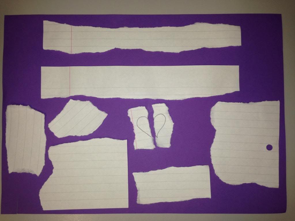
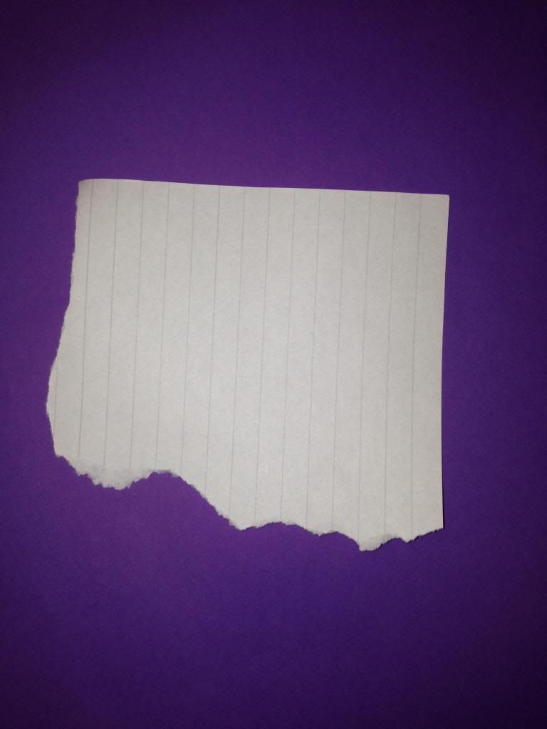
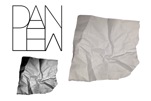
The next stage of ancillary design was compiling textures to use in them. To do this, I made my own so that the textures were exactly how I wanted them and, to another vein, free. I placed the paper on a purple background so that the background could be more easily removed to reveal the alpha channel.


When keying out the background, it is extremely important to keep a uniform colour across the frame so that the tolerance needs to be a low as possible. To achieve a better result, I used extra lighting other than my flash to cover the page. The piece at the top of the page is for the navigation bar at the header of the website, where the central piece is a love heart that, when scrolled, will align as one piece and then scroll away from each other as the user moves on. The other pieces are select tears that I wish to use throughout the site or on the digipak. The final sheet with a single piece is for the About section on my website where it will serve as the background.

Artist Logo

An important element of my ancillary tasks - and my main task should I choose to include it - is the artist logo. This reveals the identity of the artist and, in most cases, becomes the one image a fan or even anyone can look at and immediately know the artist.

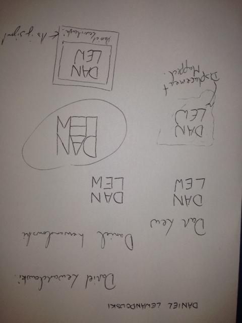
Logos vary immensely; I carried out a small amount of research before beginning the task, but only to grasp an idea of what has been done as it is important that they remain original. I then began mocking designs, playing with the artists name, Daniel Lewandowski, to find a structure for his name:


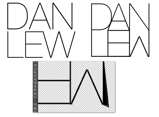
Once I had done this initial planning, I moved on to experimenting in Photoshop. I had already formed the idea of what I wanted to create so it was up to following my plans from here. The most important element of all of my designs was the specific way in which I designed the lettering so the first port of call was to create that. My favourite, san-serif font is Helvetica and the slightest version of this is Helvetica Neue Ultralight so that was the end choice. The font needed a fair bit of editing, however, so I converted the letters to paths in photoshop and reshaped them until they resembled what I wanted. The image to the left is the original font where the right image is the final result: 


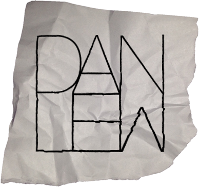
After this, I worked on my first draft. This design involved a crumpled piece of paper - in-keeping with my website -  that the text was formed to. To achieve this result, I used a displacement map in photoshop. This involved altering the contrast and brightness of the background image to make the contours much more obvious. The map is then applied to the text which then forms itself to the paper and appears to be written on it. This process created:
Logo 1

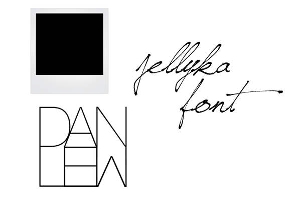
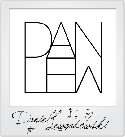
The second design involved the inclusion of a Polaroid picture background with a signature caption for a bit more personality as the first design wasn't overly complex or revealing of the artist/brand. The font I used was Jellyka Saint Andrews Queen as it caught my eye as a very detailed, personal font that could be mistaken as true handwriting, which is rare. Utilising the way the font alters characters to drawn images, I added some extra characters for decoration:
Logo 2

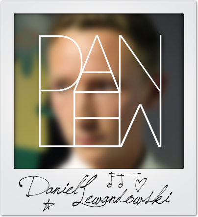
The design didn't look quite right to me and I even asked for feedback too, which a final idea flourished. I offered up the idea of a background image that was slightly blurred so as not to take away from the logo, but add colour and more of a persona. The logo then became:

Logo 3

I really like this logo as it feels like it contains all of the elements I wanted and serves as a memorable brand identity. Finally, I put the logos up for a vote amongst my peers to ascertain which was the best when my audience was concerned. Luckily, the final logo reined as champion and I agreed with my demographic. This design, therefore, will be the logo I will use in my tasks.

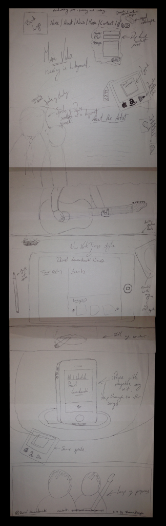
Website Plan

Due to the complexity of my ideas, it was important to have a fully fledged website plan before I began work on compiling it. This needed to be drawn by hand as it offers the most versatility when considering ideas and trying out options. The finished design is below and I shall be working closely to it in the final site: