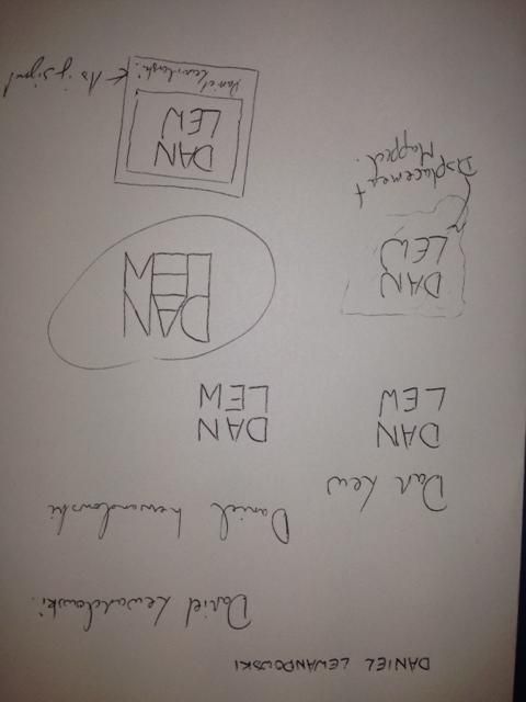
Logos vary immensely; I carried out a small amount of research before beginning the task, but only to grasp an idea of what has been done as it is important that they remain original. I then began mocking designs, playing with the artists name, Daniel Lewandowski, to find a structure for his name:
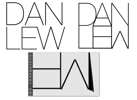
Once I had done this initial planning, I moved on to experimenting in Photoshop. I had already formed the idea of what I wanted to create so it was up to following my plans from here. The most important element of all of my designs was the specific way in which I designed the lettering so the first port of call was to create that. My favourite, san-serif font is Helvetica and the slightest version of this is Helvetica Neue Ultralight so that was the end choice. The font needed a fair bit of editing, however, so I converted the letters to paths in photoshop and reshaped them until they resembled what I wanted. The image to the left is the original font where the right image is the final result:

Logo 1
Logo 2
The design didn't look quite right to me and I even asked for feedback too, which a final idea flourished. I offered up the idea of a background image that was slightly blurred so as not to take away from the logo, but add colour and more of a persona. The logo then became:
Logo 3
 I really like this logo as it feels like it contains all of the elements I wanted and serves as a memorable brand identity. Finally, I put the logos up for a vote amongst my peers to ascertain which was the best when my audience was concerned. Luckily, the final logo reined as champion and I agreed with my demographic. This design, therefore, will be the logo I will use in my tasks.
No comments:
Post a Comment