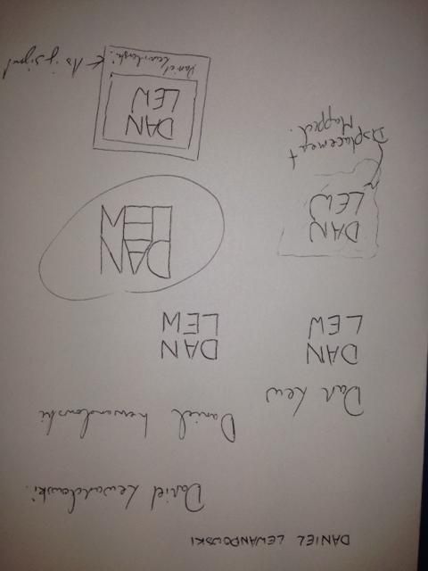
Logos vary immensely; I carried out a small amount of research before beginning the task, but only to grasp an idea of what has been done as it is important that they remain original. I then began mocking designs, playing with the artists name, Daniel Lewandowski, to find a structure for his name:
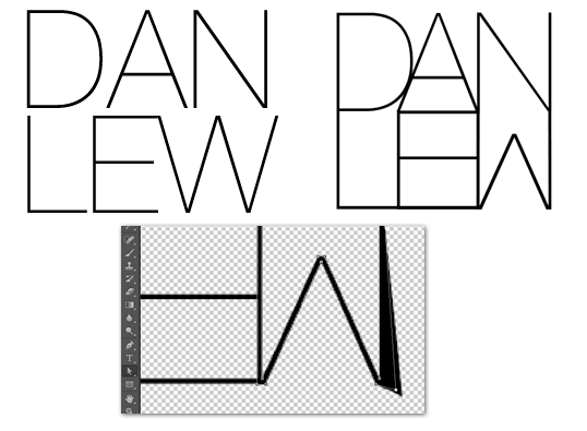
Once I had done this initial planning, I moved on to experimenting in Photoshop. I had already formed the idea of what I wanted to create so it was up to following my plans from here. The most important element of all of my designs was the specific way in which I designed the lettering so the first port of call was to create that. My favourite, san-serif font is Helvetica and the slightest version of this is Helvetica Neue Ultralight so that was the end choice. The font needed a fair bit of editing, however, so I converted the letters to paths in photoshop and reshaped them until they resembled what I wanted. The image to the left is the original font where the right image is the final result:
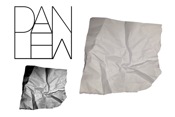 After this, I worked on my first draft. This design involved a crumpled piece of paper - in-keeping with my website - that the text was formed to. To achieve this result, I used a displacement map in photoshop. This involved altering the contrast and brightness of the background image to make the contours much more obvious. The map is then applied to the text which then forms itself to the paper and appears to be written on it. This process created: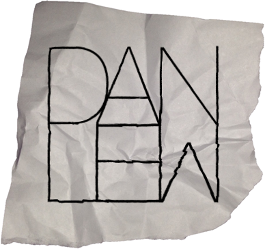
Logo 1
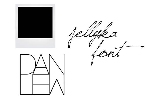 The second design involved the inclusion of a Polaroid picture background with a signature caption for a bit more personality as the first design wasn't overly complex or revealing of the artist/brand. The font I used was Jellyka Saint Andrews Queen as it caught my eye as a very detailed, personal font that could be mistaken as true handwriting, which is rare. Utilising the way the font alters characters to drawn images, I added some extra characters for decoration: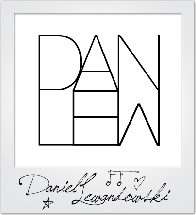
Logo 2
The design didn't look quite right to me and I even asked for feedback too, which a final idea flourished. I offered up the idea of a background image that was slightly blurred so as not to take away from the logo, but add colour and more of a persona. The logo then became:
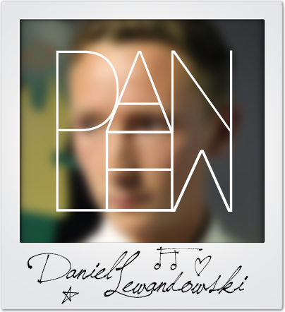
Logo 3
 I really like this logo as it feels like it contains all of the elements I wanted and serves as a memorable brand identity. Finally, I put the logos up for a vote amongst my peers to ascertain which was the best when my audience was concerned. Luckily, the final logo reined as champion and I agreed with my demographic. This design, therefore, will be the logo I will use in my tasks.