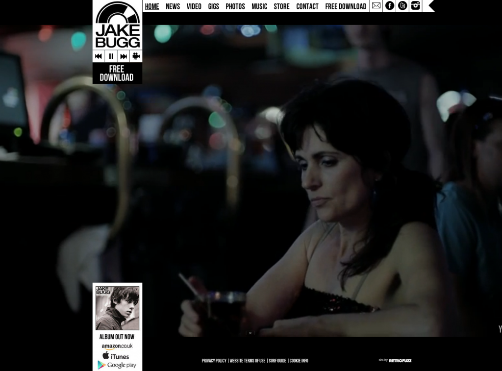
Concurrent with my Digipak research, I am carrying out research into Artist websites so that I can create a website conventional to these. After a little research, however, I wasn't incredibly impressed with a great number of the designs so I am also carrying out research into other websites to take inspiration from and form ideas to merge with the band's website. A feature I really liked, however, from Jake Bugg's website is the rolling video background which includes all of his music videos and some promotional films. This means the user can navigate his site while experiencing his content, creating an incredibly effective promotional site. I will most probably be using the HTML5 code here for this feature:
As there isn't much content on the first page, though, I plan to merge this idea with the current structure of the Spotify website where images and backgrounds scroll and differing speeds which heightens interactivity and makes information transfer more efficient:
After some further research, I found that the effect seen above is known as the Parallax Scrolling effect and can be achieved a number of different ways. As this is definitely my favoured idea, I have looked into certain source code and tutorials for creation; one of which, I found at www.GitHub.com and offers all of the code needed for including videos, backgrounds, sprites and text which covers everything I would need. This idea allows for a great deal of band promotion as images feature very heavily. I can take a number of photographs on our shoots to satisfy this.
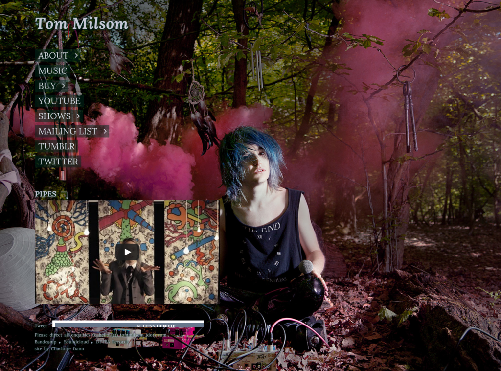
Another artist site that I think looks appealing is Tom Milsom's. The main feature that makes similar web pages lose appeal seems to be the over saturation of tour dates and the lack of organisation with these. Milsom's page isn't like this, but Like Bugg's has little content so any inspiration taken would have to be combined with others. The photography is very nice, however, so I can draw from this:
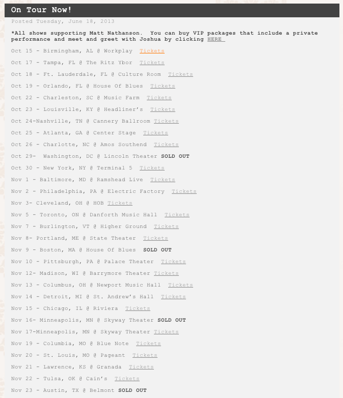
The example to the left is of Joshua Radin's site, which overuses dates and is of a blog style. I want to avoid both of these to produce a smart, original site. The dates make the site very bloated and clunky which is unattractive. The blog form is also very unoriginal and so wouldn't be impressive at all.
In addition, I want to create a raw theme by including elements such as ripped paper backgrounds to lay titles over which I would create myself as quality stock photos of this are rare:
Just love your article.I do always look over your website for new articles.I am recently working on an app spotify premium apk how thats going awesome and special thanks to you :)

Just love your article.I do always look over your website for new articles.I am recently working on an app spotify premium apk how thats going awesome and special thanks to you :)
ReplyDeleteI have been using this app League of War Apk: and downloaded and gambling it frequently.
ReplyDelete