Please find below my blog, which I have used to exhibit my research and planning. Throughout the process, I have also posted both my draft and final production pieces as they were completed and these can be found in their respective posts.
The blog can be navigated more efficiently via the labels to the right of the page which break down the posts into certain categories, for instance, the 'Main Task' label links to posts such as my final and draft Music Video productions and the specific planning stages for this task.
I hope you find reading about my project interesting and enjoy my final production pieces.
Ross Freeman

Ancillary Task Edit Decisions
Much like with my Music Video, I decided it was necessary to produce an edit decisions document for my ancillary tasks. The following document shows these decisions:
Ancillary Task: Website Final
 |
| Click the image to view the site |
Unfortunately, due to the complex elements involved, the site is not compatible with all older browsers and would require an updated browser such as Google Chrome, Mozilla Firefox, Safari or a newer version of Internet Explorer.
Most people have an updated browser, anyway, so this is not much of an issue.
Ancillary Task: Digipak Draft and Final
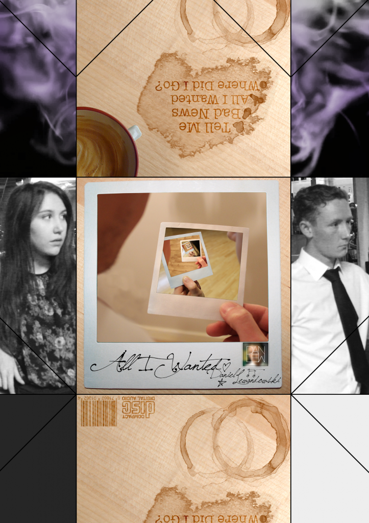
To successfully produce my Digipak, I felt it necessary to produce a draft of the digipak which leaves room for improvement. There is, however, very little difference to the final article as I wanted to gain feedback from colleagues and to reflect on it myself. Below is the draft for my digipak:

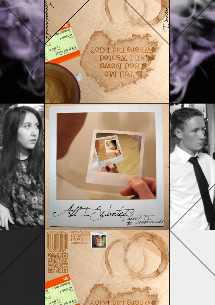
The digipak, I felt needed a few extra elements, which are listed below with the final copy:

The digipak, I felt needed a few extra elements, which are listed below with the final copy:
- Removal of logo on the front cover and placing it on the back
- Inclusion of a QR code on the back
- Addition of a train ticket on the back cover to connote memories and someone moving away
- Artist name/signature included on the fold over flaps
Edit Decisions
Instead of an edit decisions list as I made the Music Video, I decided it would be much more useful to wait until I had finished the video to detail every single editing technique and complex shot choice in the following document. I believe it sufficiently details the effort I put into my work:
All I Wanted Music Video - Final
After much refinement and further editing, I have completed my Music Video for Daniel Lewandowski's song, All I Wanted. I am very proud of the end result as it is a conglomeration of my editing skills and shot choice, put into five minutes. I opted for the flashback scenes to be in black and white, with some added glow, which was to the benefit as it is now much more understood by the audience members I have shown.
Ancillary Task - Digipak Charley Photographs
As I do not need photographs of both of my actors together for the digipak ancillary task; it has become much easier to attain these photographs. I, therefore, today took the required photos with Charley - my main female actress - to then supplement them with Dave's when I can. A video of the photos can be found below, with the larger images provided:
Ancillary Task - Digipak design
In preparation for my new digipak design, I have created a flat plan of the main image that will feature on the front of the pack. The ovals are the characters holding polaroid images and these will alternate between the artist and his partner. I will alter the position of the actor so that the product looks more interesting and less repetitive.
Theory Application: Dyer's Star theory
"A star is a construct of the industry it pertains to, not a real person." - Richard Dyer
This is the idea first proposed by Richard Dyer, the English Specialist who proposed ideas about cinema, though his concepts apply incredibly well to the ideas of Music videos. The majority of successful music videos feature a subject performing the song the video is for. A further internal majority of these use a famous or well-known subject to complete this function or at least act in the video.
Essentially, people are complex. They are the perfect choice for the producer who wants to form an emotional connection between character and audience, but they are very difficult for the producer who is designing for the mass market. By selecting a well known actor to not act, but appear in the video, they achieve that cross-media convergence through synergy that mutually benefits both industries.
This is extremely general, however, as this isn't always the case. The producer of 'I Want Love' by Elton John, for instance, created the perfect balance as his choice of actor is impeccable, bettering the overall effect. The examples above are the more successful uses of stars, but often they are simply included to raise the reputation of the video. To work this way, I deeply considered involving the original artist of my music video, but the logistics were incredibly difficult. The opening scene - now another actor smoking and walking away form the function hall - was originally planned to be acted by the artist where I would contact him and ask for him to film it. Directing from so far away, however, would have been difficult and the result would not have been my own.

 The theory further, predominantly applies to the exploitation of people to create images for the audience to enjoy or aspire to and ultimately dehumanises the subject. The main identifier for the occurrence of this is when artists become less-linked to their original medium. For example, Cheryl Cole started as a singer in a pop group and this was her identity. Quickly, however, she branched into other areas where she became a reality TV judge, product advertiser - needless to mention tabloid scandal. Her audience became more focused on her personal life and other exploits that music almost takes a side-line. This is, however, not at all to the detriment of her music career, but benefits her. Stars begin to profit from their status and audiences support their music not fir its quality, but their loyalty to them. This is so much more of a benefit to the industry as they have many stars to their disposal and can exploit them how they wish.
This is extremely general, however, as this isn't always the case. The producer of 'I Want Love' by Elton John, for instance, created the perfect balance as his choice of actor is impeccable, bettering the overall effect. The examples above are the more successful uses of stars, but often they are simply included to raise the reputation of the video. To work this way, I deeply considered involving the original artist of my music video, but the logistics were incredibly difficult. The opening scene - now another actor smoking and walking away form the function hall - was originally planned to be acted by the artist where I would contact him and ask for him to film it. Directing from so far away, however, would have been difficult and the result would not have been my own.

 The theory further, predominantly applies to the exploitation of people to create images for the audience to enjoy or aspire to and ultimately dehumanises the subject. The main identifier for the occurrence of this is when artists become less-linked to their original medium. For example, Cheryl Cole started as a singer in a pop group and this was her identity. Quickly, however, she branched into other areas where she became a reality TV judge, product advertiser - needless to mention tabloid scandal. Her audience became more focused on her personal life and other exploits that music almost takes a side-line. This is, however, not at all to the detriment of her music career, but benefits her. Stars begin to profit from their status and audiences support their music not fir its quality, but their loyalty to them. This is so much more of a benefit to the industry as they have many stars to their disposal and can exploit them how they wish.
Ancillary Task - Further Digipak research


 The second product is the fully online Reflections album. The album artwork is available entirely online to download and print. It can further be folded and assembled without glue or scissors. This raw, resourceful product would be perfect for my needs as it fits the theme of my project. I made a good majority of my previous design choices to work alongside this raw, acoustic feel and I feel an addition such as this would work great so that is the template I shall be basing my ancillary on. Below is a video that Brett Domino released for the folding of the artwork which would be a nice further project to facilitate the production were it a profitable business.
From Brett Dominos design, I have produced my own template to work from.
All I Wanted Music Video - Draft
Below is the first draft of my music video. The draft is incomplete, but it is a basis to work by and to tweak as I complete the project. My next draft shall be complete and the upload after that will be my final product.
Shooting Plans
Unfortunately, I have had some issues contacting and organising dates with Rubix, my location, due to absences and a breakdown in communication. To resolve this, I decided the best tactic would be to visit the Manager during trade hours to ascertain a date that I could use the location for the remainder of my time. Upon visiting the Manager, it became clear he had agreed a date for me to use the location with a subordinate which hadn't been relayed yet, which meant there was little difficulty securing the date.
Concurrently, it was necessary to organise a second video shoot for the scenes that are not set in the night club, which was much easier to do as the location is my own home. This shoot will take place first, so that the final shoot will be in the night club and all of my footage will be complete.
Finally, I completed a shoot for the opening scene of my production the other day where I used my Dad, who featured in my AS production. After the shoot in Rubix, hopefully all of my raw footage should be available and I can complete the production.
Concurrently, it was necessary to organise a second video shoot for the scenes that are not set in the night club, which was much easier to do as the location is my own home. This shoot will take place first, so that the final shoot will be in the night club and all of my footage will be complete.
Finally, I completed a shoot for the opening scene of my production the other day where I used my Dad, who featured in my AS production. After the shoot in Rubix, hopefully all of my raw footage should be available and I can complete the production.
Paper Elements
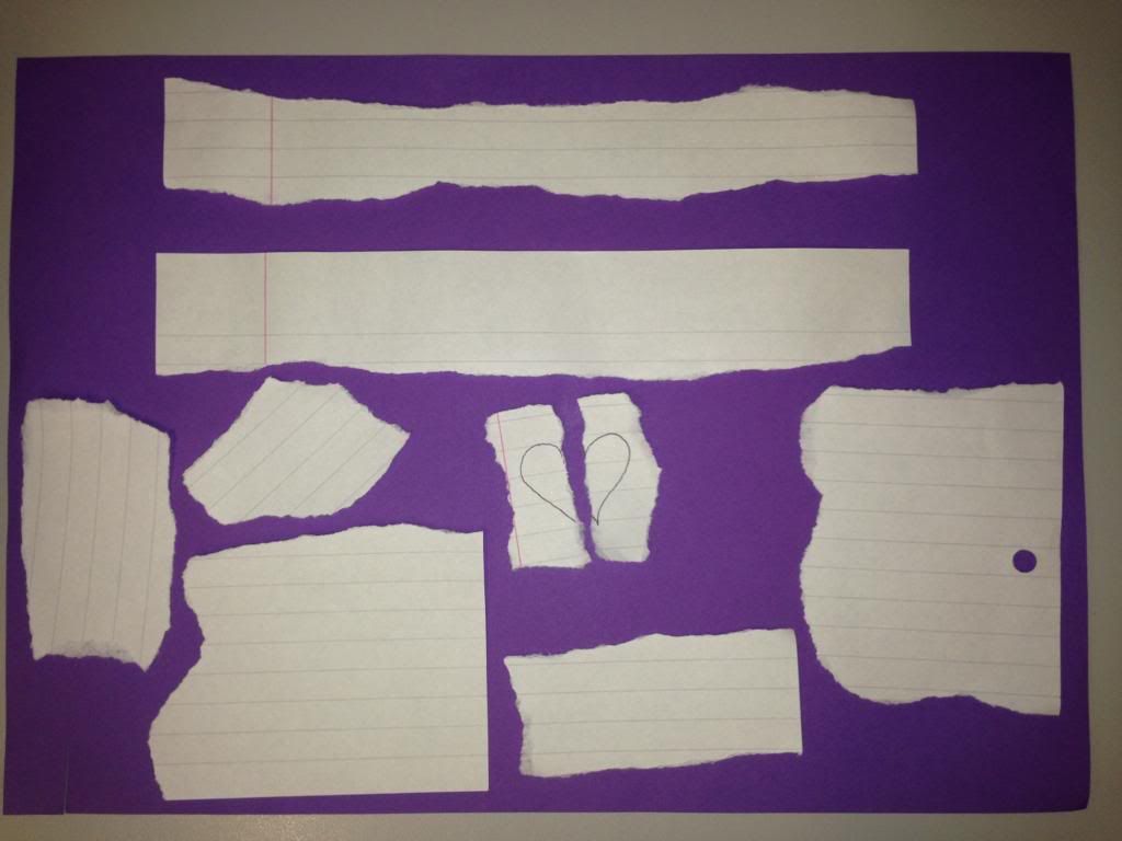
The next stage of ancillary design was compiling textures to use in them. To do this, I made my own so that the textures were exactly how I wanted them and, to another vein, free. I placed the paper on a purple background so that the background could be more easily removed to reveal the alpha channel.


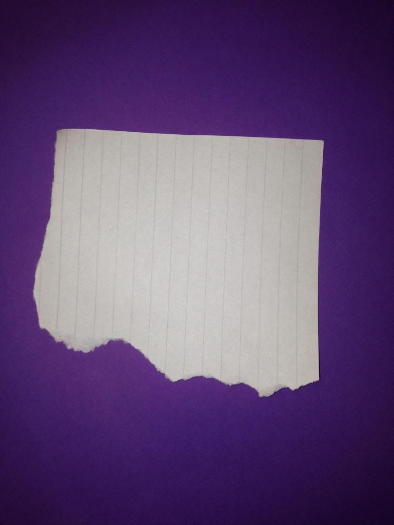
 When keying out the background, it is extremely important to keep a uniform colour across the frame so that the tolerance needs to be a low as possible. To achieve a better result, I used extra lighting other than my flash to cover the page. The piece at the top of the page is for the navigation bar at the header of the website, where the central piece is a love heart that, when scrolled, will align as one piece and then scroll away from each other as the user moves on. The other pieces are select tears that I wish to use throughout the site or on the digipak. The final sheet with a single piece is for the About section on my website where it will serve as the background.
 When keying out the background, it is extremely important to keep a uniform colour across the frame so that the tolerance needs to be a low as possible. To achieve a better result, I used extra lighting other than my flash to cover the page. The piece at the top of the page is for the navigation bar at the header of the website, where the central piece is a love heart that, when scrolled, will align as one piece and then scroll away from each other as the user moves on. The other pieces are select tears that I wish to use throughout the site or on the digipak. The final sheet with a single piece is for the About section on my website where it will serve as the background.
Artist Logo
An important element of my ancillary tasks - and my main task should I choose to include it - is the artist logo. This reveals the identity of the artist and, in most cases, becomes the one image a fan or even anyone can look at and immediately know the artist.
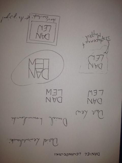
Logos vary immensely; I carried out a small amount of research before beginning the task, but only to grasp an idea of what has been done as it is important that they remain original. I then began mocking designs, playing with the artists name, Daniel Lewandowski, to find a structure for his name:


 After this, I worked on my first draft. This design involved a crumpled piece of paper - in-keeping with my website - that the text was formed to. To achieve this result, I used a displacement map in photoshop. This involved altering the contrast and brightness of the background image to make the contours much more obvious. The map is then applied to the text which then forms itself to the paper and appears to be written on it. This process created:

 The second design involved the inclusion of a Polaroid picture background with a signature caption for a bit more personality as the first design wasn't overly complex or revealing of the artist/brand. The font I used was Jellyka Saint Andrews Queen as it caught my eye as a very detailed, personal font that could be mistaken as true handwriting, which is rare. Utilising the way the font alters characters to drawn images, I added some extra characters for decoration:


 I really like this logo as it feels like it contains all of the elements I wanted and serves as a memorable brand identity. Finally, I put the logos up for a vote amongst my peers to ascertain which was the best when my audience was concerned. Luckily, the final logo reined as champion and I agreed with my demographic. This design, therefore, will be the logo I will use in my tasks.
Logos vary immensely; I carried out a small amount of research before beginning the task, but only to grasp an idea of what has been done as it is important that they remain original. I then began mocking designs, playing with the artists name, Daniel Lewandowski, to find a structure for his name:
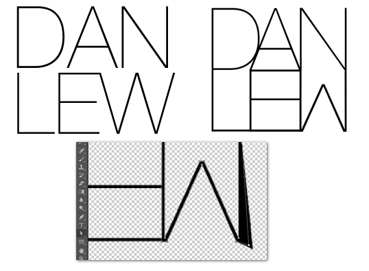
Once I had done this initial planning, I moved on to experimenting in Photoshop. I had already formed the idea of what I wanted to create so it was up to following my plans from here. The most important element of all of my designs was the specific way in which I designed the lettering so the first port of call was to create that. My favourite, san-serif font is Helvetica and the slightest version of this is Helvetica Neue Ultralight so that was the end choice. The font needed a fair bit of editing, however, so I converted the letters to paths in photoshop and reshaped them until they resembled what I wanted. The image to the left is the original font where the right image is the final result:
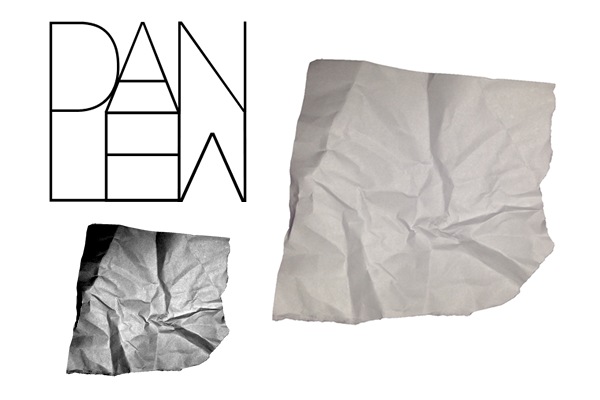 After this, I worked on my first draft. This design involved a crumpled piece of paper - in-keeping with my website - that the text was formed to. To achieve this result, I used a displacement map in photoshop. This involved altering the contrast and brightness of the background image to make the contours much more obvious. The map is then applied to the text which then forms itself to the paper and appears to be written on it. This process created: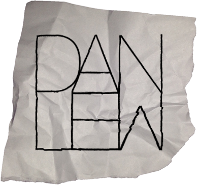
Logo 1
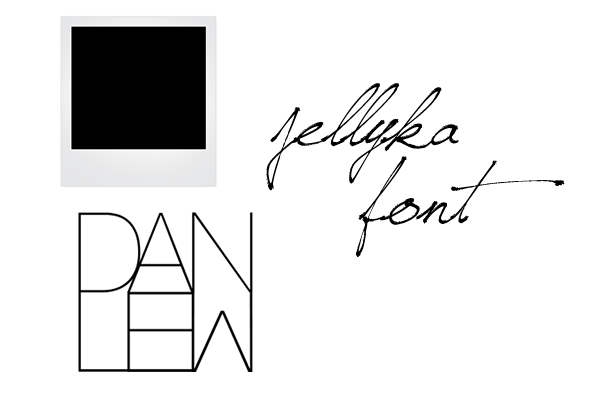 The second design involved the inclusion of a Polaroid picture background with a signature caption for a bit more personality as the first design wasn't overly complex or revealing of the artist/brand. The font I used was Jellyka Saint Andrews Queen as it caught my eye as a very detailed, personal font that could be mistaken as true handwriting, which is rare. Utilising the way the font alters characters to drawn images, I added some extra characters for decoration: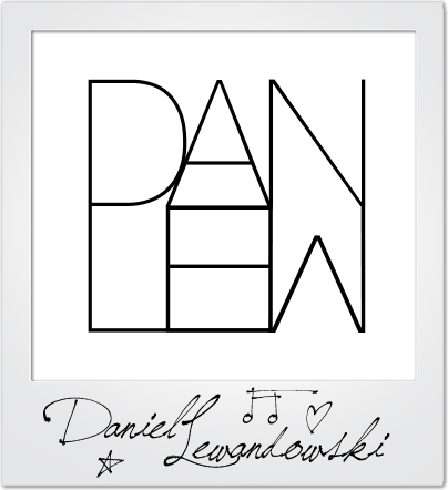
Logo 2
The design didn't look quite right to me and I even asked for feedback too, which a final idea flourished. I offered up the idea of a background image that was slightly blurred so as not to take away from the logo, but add colour and more of a persona. The logo then became:
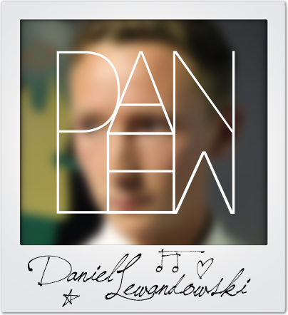
Logo 3
 I really like this logo as it feels like it contains all of the elements I wanted and serves as a memorable brand identity. Finally, I put the logos up for a vote amongst my peers to ascertain which was the best when my audience was concerned. Luckily, the final logo reined as champion and I agreed with my demographic. This design, therefore, will be the logo I will use in my tasks.
Website Plan
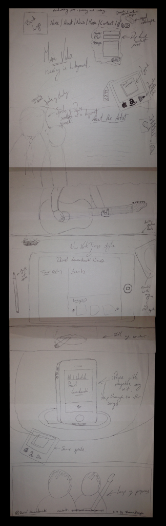
Due to the complexity of my ideas, it was important to have a fully fledged website plan before I began work on compiling it. This needed to be drawn by hand as it offers the most versatility when considering ideas and trying out options. The finished design is below and I shall be working closely to it in the final site:

Ancillary Task Research - Website Home Page
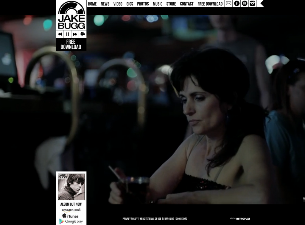
Concurrent with my Digipak research, I am carrying out research into Artist websites so that I can create a website conventional to these. After a little research, however, I wasn't incredibly impressed with a great number of the designs so I am also carrying out research into other websites to take inspiration from and form ideas to merge with the band's website. A feature I really liked, however, from Jake Bugg's website is the rolling video background which includes all of his music videos and some promotional films. This means the user can navigate his site while experiencing his content, creating an incredibly effective promotional site. I will most probably be using the HTML5 code here for this feature:
As there isn't much content on the first page, though, I plan to merge this idea with the current structure of the Spotify website where images and backgrounds scroll and differing speeds which heightens interactivity and makes information transfer more efficient:
 |
| www.JakeBugg.com |
After some further research, I found that the effect seen above is known as the Parallax Scrolling effect and can be achieved a number of different ways. As this is definitely my favoured idea, I have looked into certain source code and tutorials for creation; one of which, I found at www.GitHub.com and offers all of the code needed for including videos, backgrounds, sprites and text which covers everything I would need. This idea allows for a great deal of band promotion as images feature very heavily. I can take a number of photographs on our shoots to satisfy this.
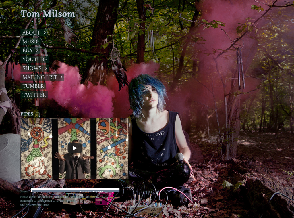
Another artist site that I think looks appealing is Tom Milsom's. The main feature that makes similar web pages lose appeal seems to be the over saturation of tour dates and the lack of organisation with these. Milsom's page isn't like this, but Like Bugg's has little content so any inspiration taken would have to be combined with others. The photography is very nice, however, so I can draw from this:
 |
www.TomMilsom.com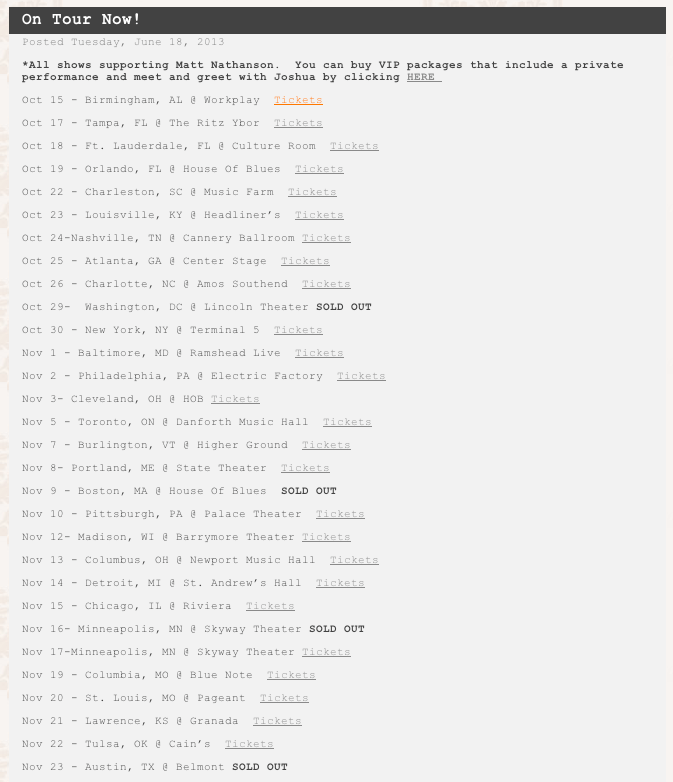 In addition, I want to create a raw theme by including elements such as ripped paper backgrounds to lay titles over which I would create myself as quality stock photos of this are rare:  |
Subscribe to:
Posts (Atom)